Route time ≠ paid hours
Route time is the time actually spent on the route. Paid hours come from a matching Calendar shift or your saved estimate. They serve different purposes.
 MyDrop Tracker
A closer look at MyDrop
See what goes into each part of the app, what comes back out, and what those results actually mean.
Real screenshots from Darren’s app. The figures describe these records, not results you should expect.
What goes into MyDrop?
You enter the route date, rostered shift start, actual route time, total weight, mileage, drops and any notes you want to keep. Add pay settings or connect Apple Calendar if those features help you.
These are your personal records, stored on your device. MyDrop doesn’t automatically track your location, steps or heart rate, and doesn’t upload your route database to a MyDrop server.
Read how your information is handled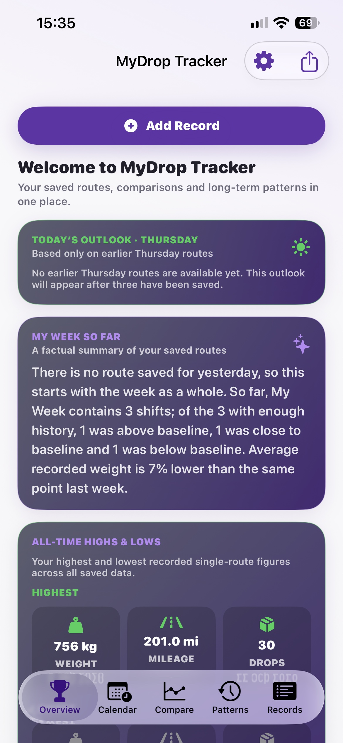
01 · Overview
Your saved route records and the day you chose as the start of your week.
Today’s Outlook looks at earlier routes on the same weekday. My Week So Far brings together the routes recorded in your current week.
An outlook needs at least three earlier routes from that weekday. If it’s empty, your history is still building. It is a summary of previous days, not a forecast of your assigned deliveries.
In this screenshot, there are no earlier Thursday routes, so MyDrop explains why it cannot show a Thursday outlook yet.

02 · Highs, lows & calendar averages
The route time, weight, miles and drops recorded across your saved history. Optional pay figures use your saved pay settings.
Highs and lows pick out individual route records. Calendar averages group records by weekday or month to show what has been typical in your own history.
A highest weight or longest distance is a recorded fact, not a target or a judgement. An average describes the records available; it can change as you add more.
The 756 kg high belongs to one route. The Sunday averages below it are calculated from eight Sunday routes. Those are two different views of the data.
03 · Work Calendar
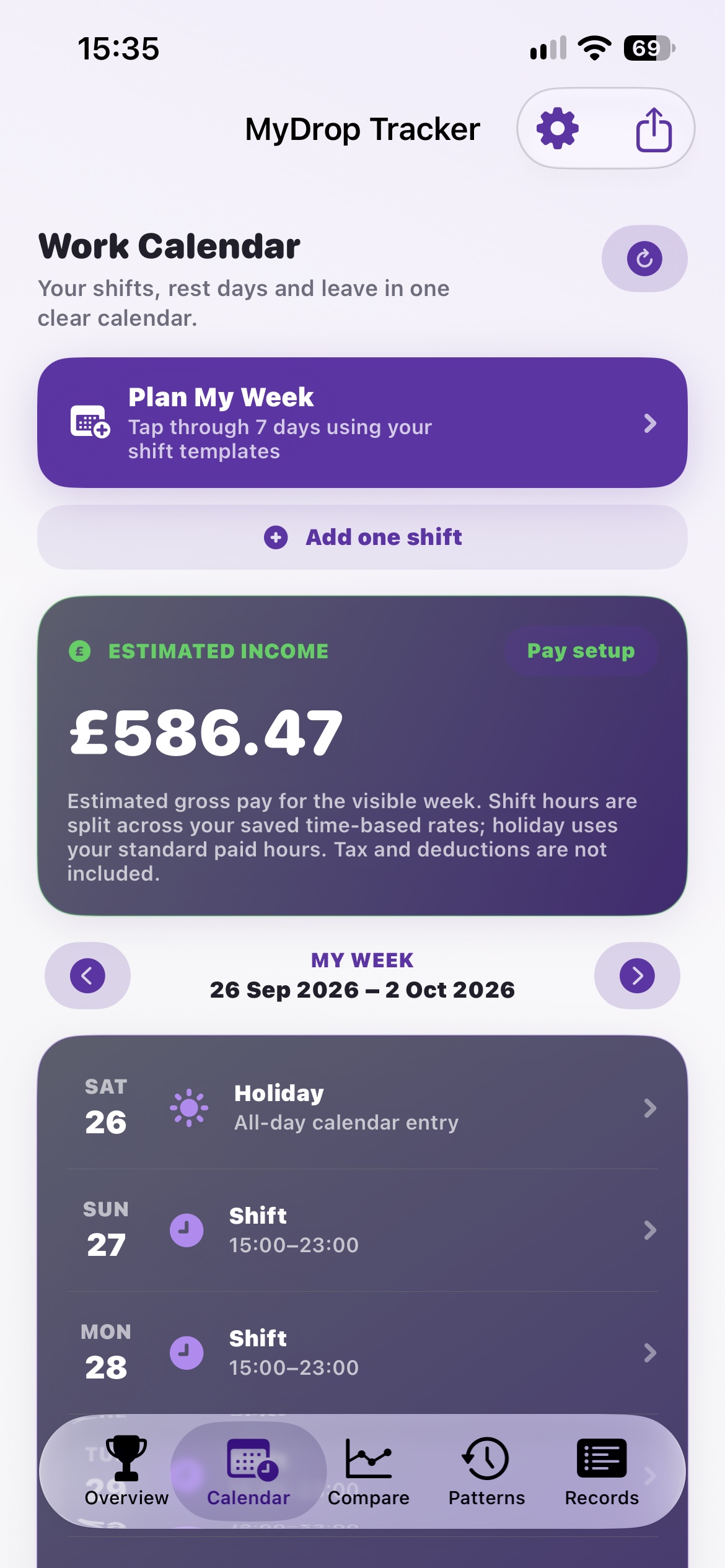
Shift templates, planned start and end times, rest days and leave. If you enable Apple Calendar access, MyDrop reads and manages supported work events.
A view of your working week and an optional gross income estimate based on hours, rates and the rules you entered. Plan My Week helps you fill seven days using templates.
Estimated income is before tax and deductions. Check your rates and breaks in Pay Setup. Calendar events stay in Calendar and are not included in a MyDrop backup.
The £586.47 figure is an estimate for the week shown in this screenshot. It is not a guaranteed payment or take-home pay.
04 · Compare
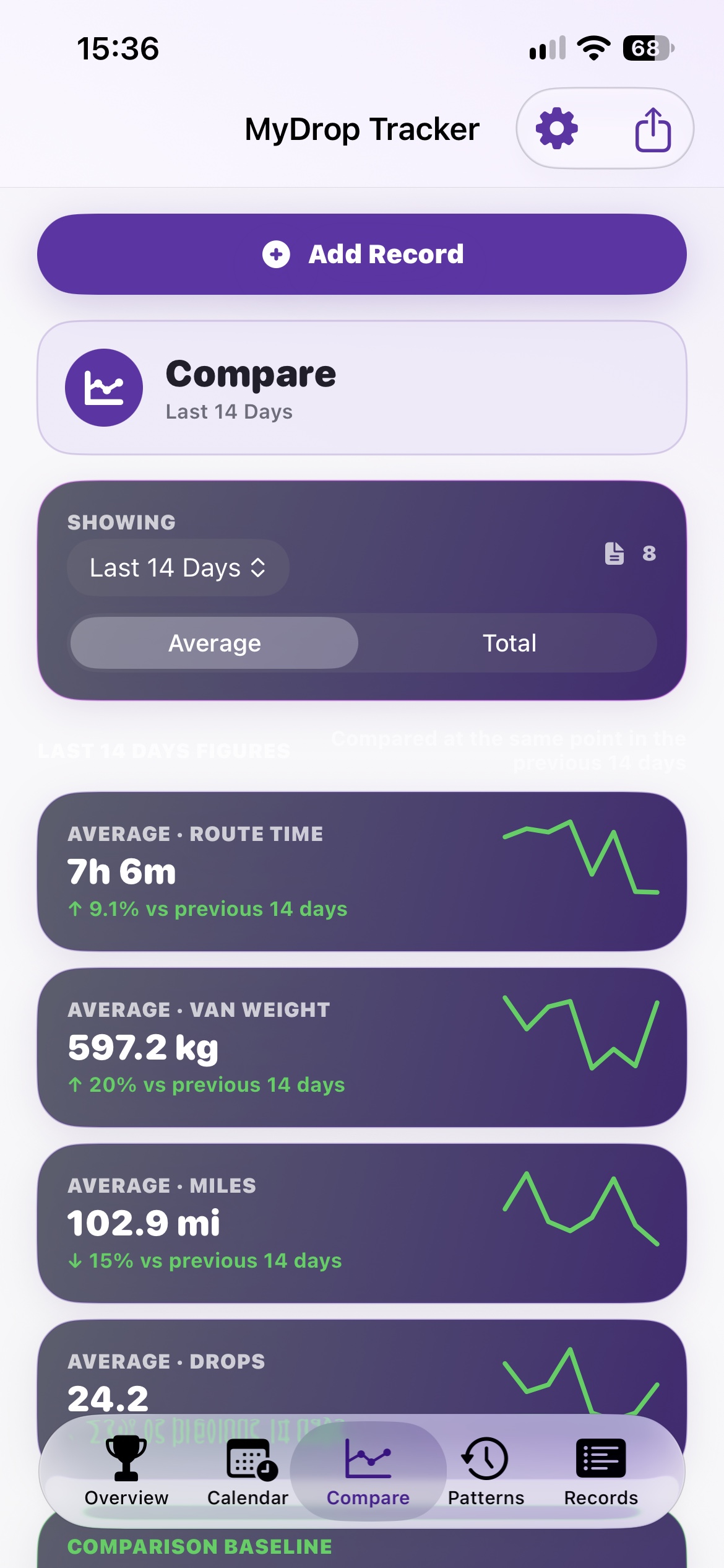
Saved routes within your selected period, with the matching earlier comparison period. Choose Average or Total depending on the question you want to answer.
Route time, weight, miles and drops, with changes against the comparison period and small charts showing the recorded pattern.
Average describes a typical recorded route; Total adds the available values together. A percentage describes change, not whether a result is good or bad. Missing entries affect the picture.
Here, average miles are 15% lower and average weight is 20% higher than the previous 14 days. That does not tell us how the driver felt or whether the work was harder.
05 · Shift Patterns
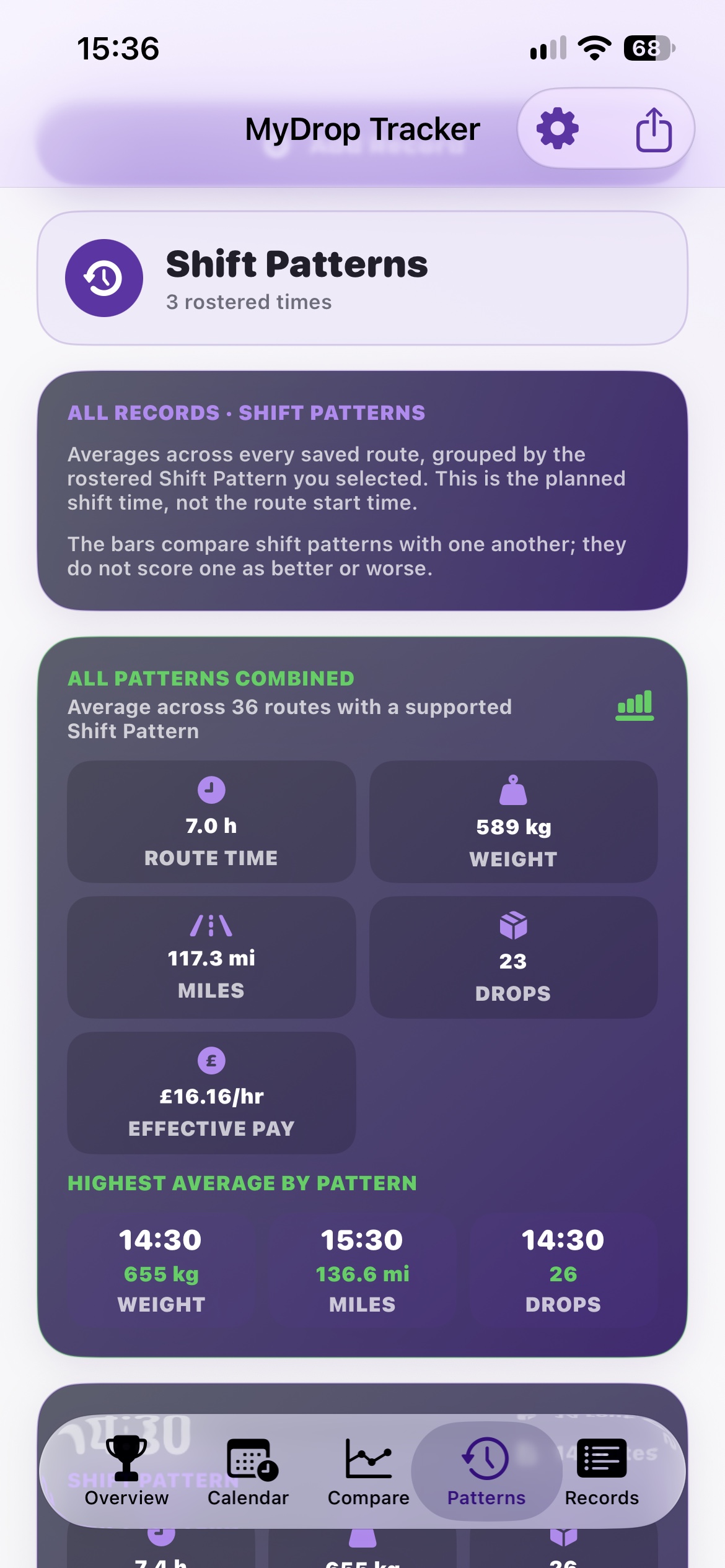
All saved routes with a supported rostered Shift Pattern start time, grouped by that planned start.
Averages for each shift pattern and a combined view across supported records. The bars compare patterns with one another.
A shift pattern is the planned shift start, not the time you left the depot or the duration of your route. These are personal historical averages, not rankings of good and bad shifts.
This screen combines 36 routes. It also identifies which shift patterns have the highest recorded average weight, mileage and drops.
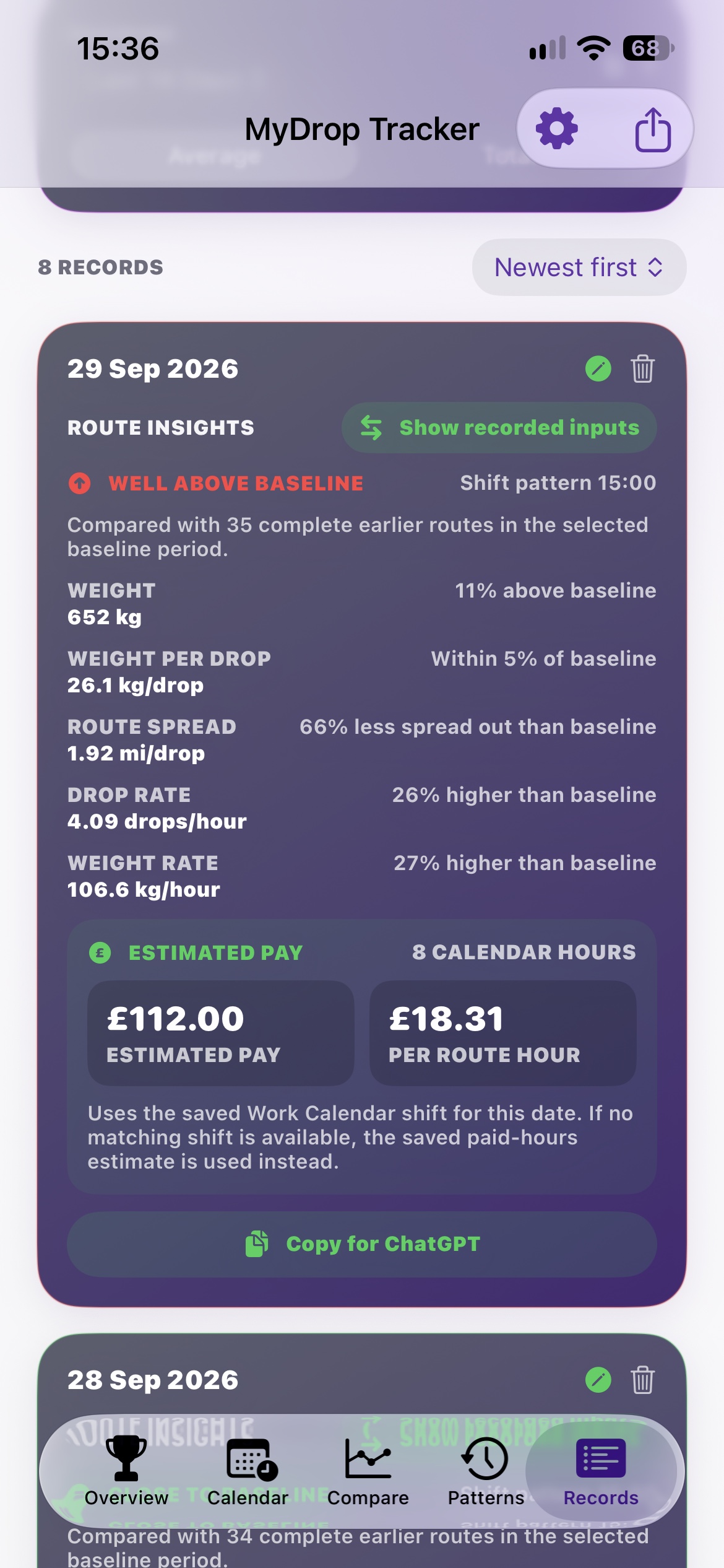
06 · Records & Route Insights
The original inputs you saved for that route: weight, drops, miles and actual route time, plus its date and shift pattern.
Weight per drop = weight ÷ drops. Route spread = miles ÷ drops. Drop rate = drops ÷ route hours. Weight rate = weight ÷ route hours.
Lower miles per drop means deliveries were more concentrated. Higher drops per hour describes this record; it is not a performance target. Use Show recorded inputs to check the figures behind the calculation.
The screenshot shows 652 kg, 26.1 kg per drop and 1.92 miles per drop. Estimated pay of £112 uses 8 Calendar hours; £18.31 per route hour divides that pay by actual route time. It is not the contractual hourly rate.
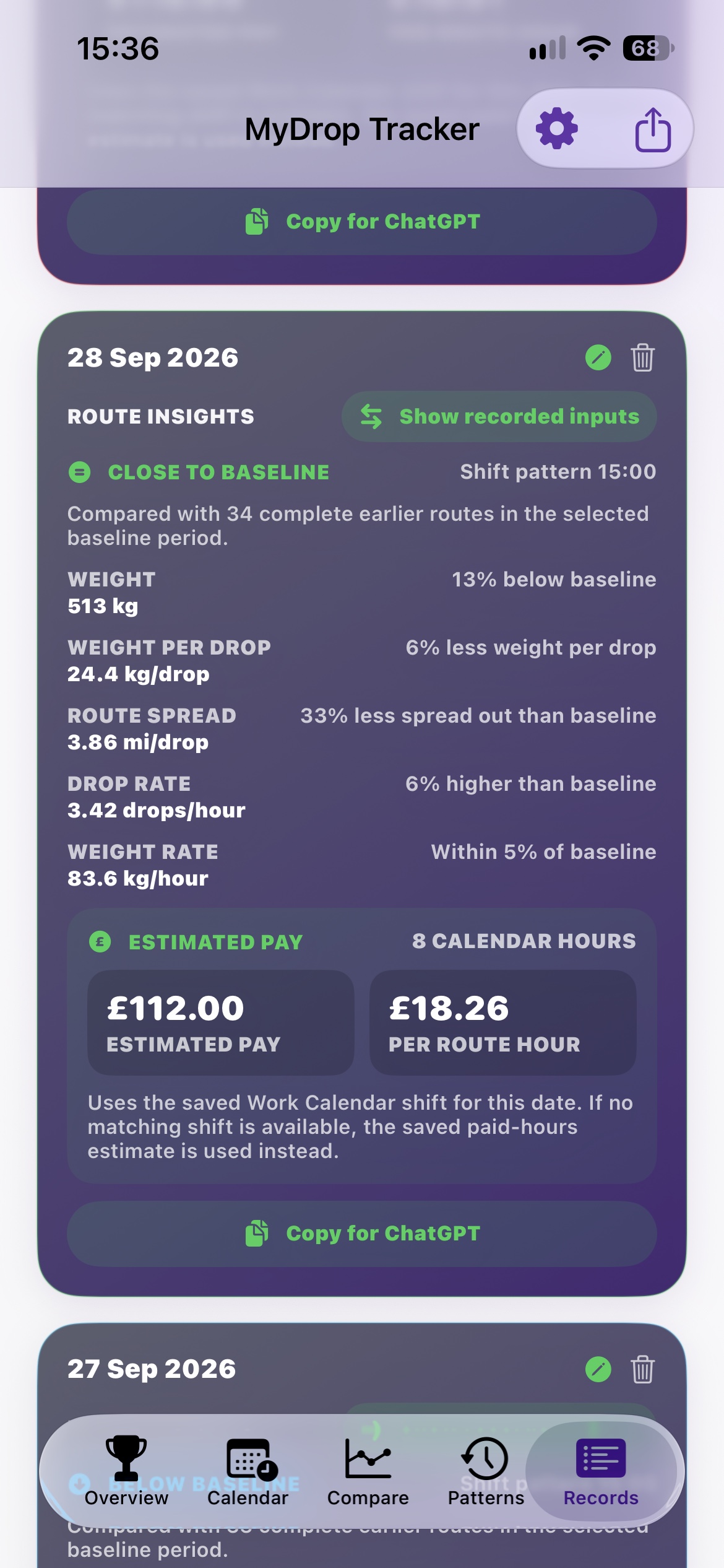
07 · Reading the comparison labels
At least three complete earlier routes in the selected baseline window, with weight, weight per drop and miles per drop available. The current route is excluded.
MyDrop combines the relative change in total weight, weight per drop and route concentration, giving all three equal weight. More concentrated means fewer miles per drop.
Below, close to, above and well above baseline describe that combined comparison. They do not measure effort, stress, safety or driver ability. A route can have lower weight and still be close overall because its other measurements differ.
In this record, weight is 13% below baseline, but the route is also 33% less spread out. The combined result is Close to baseline. The app shows the earlier-route count so you can see how much history supports it.
A few useful distinctions
Route time is the time actually spent on the route. Paid hours come from a matching Calendar shift or your saved estimate. They serve different purposes.
It’s an average of your earlier records. Staying close to it is just as valid a finding as moving above or below it.
CSV helps you read your records elsewhere. A full MyDrop backup also includes settings and can restore your app data.
MyDrop averages three relative changes: total weight, weight per drop, and the decrease in miles per drop. Each contributes one third. The concentration term is (earlier average miles per drop − current miles per drop) ÷ earlier average miles per drop.
The combined change is labelled Below baseline under −10%; Close to baseline from −10% up to (but not including) +10%; Above baseline from +10% up to +25%; and Well above baseline at +25% or more. Individual metric descriptions use a separate “Within 5%” band when the absolute change is less than 5%.
Drop rate, weight rate and pay provide additional context; they are not part of that combined label. Percentages shown on screen are rounded.
Start with the setup guide, and keep a separate backup as your history grows.